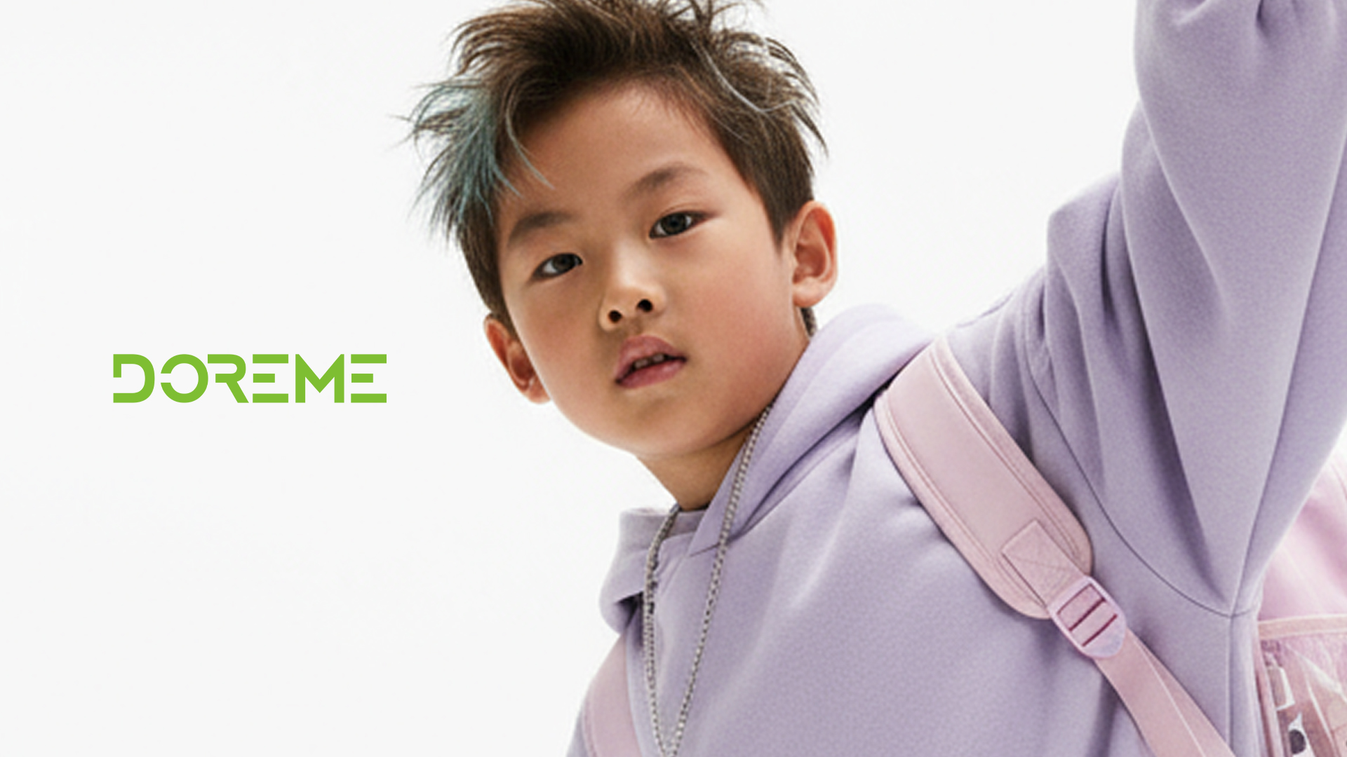
Doreme - e-commerce
UIX
UIX
ROLE
ROLE
UI/UX Designer
UI/UX Designer
TIMELINE
TIMELINE
Oct 25 - Ongoing
Oct 25 - Ongoing
TEAM
TEAM
1 Product Manager 1 Copywriter 1 UI/UX Designer
1 Product Manager 1 Copywriter 1 UI/UX Designer
SKILLS
SKILLS
Interface Design Interaction Design User Experience Design
Interface Design Interaction Design User Experience Design
Doreme is a leading kids’ fashion brand scaling from offline retail to a digital-first identity. I led the design of their e-store to bridge the gap between their physical success and the digital market.
The challenge
was to streamline the parenting journey through a mobile-first shopping experience that makes finding safe, high-quality children’s wear effortless. Naturally driving brand loyalty and sustainable revenue growth by removing the friction from the buying process.
The challenge
was to streamline the parenting journey through a mobile-first shopping experience that makes finding safe, high-quality children’s wear effortless. Naturally driving brand loyalty and sustainable revenue growth by removing the friction from the buying process.
Discovery
To move beyond assumptions, we began with a deep audit of the existing brand and market landscape. By mapping out the current user journey, we identified exactly where parents were dropping off and what emotional needs—like trust and speed—were being ignored.
Discovery
To move beyond assumptions, we began with a deep audit of the existing brand and market landscape. By mapping out the current user journey, we identified exactly where parents were dropping off and what emotional needs—like trust and speed—were being ignored.
Key findings
Our research confirmed that a mobile-first strategy was non-negotiable, as over 75% of users shop via mobile in short bursts. We discovered that even a one-second delay could cut conversions by 20%.
The Trust Gap: Missing size guides and reviews caused high cart abandonment.
Navigation Friction: Hidden buttons and complex filters made browsing difficult on small screens.
Visual Disconnect: A lack of premium imagery prevented the brand’s offline success from translating digitally.
These insights led us to prioritize a one-tap shopping flow focused on speed, clarity, and instant credibility.
Upgraded Product Card
I redesigned the product card to reduce friction and provide essential information at a glance, ensuring a faster path to purchase. By integrating user ratings directly onto the card, I addressed the trust gap with immediate social proof. I also improved the visual hierarchy by adding high-visibility discount and product badges like "New" to help parents quickly identify value while scanning. Finally, I embedded color options within the card to streamline the selection process, allowing users to explore variations without needing to leave the main browsing feed.
Connect to Content
Add layers or components to swipe between.
Revamped Menu FAB
To maximize screen real estate and reduce visual noise, I replaced the static bottom navigation with a dynamic floating action button. This component functions like a live organism, adapting its state based on user intent. While idle, the button expands to offer proactive search suggestions, and when triggered, it reveals a centralized menu for categories and account management. Once a product is selected, the component intelligently adapts to include a cart button, accompanied by a nudge to buy more. This strategy creates a sense of urgency and encourages higher cart values while keeping the interface focused and clean.
Connect to Content
Add layers or components to swipe between.
Brand New Product Details Page
To optimize product discovery, we explored various layouts to determine which format best encouraged exploration. The final design introduces a gesture-based navigation system where users can swipe left or right to instantly switch between similar styles. Within the product details and reviews, we integrated a horizontal thumbnail list to keep related items visible without disrupting the flow. To drive conversion, a live marquee highlights how many carts currently hold the item, creating a subtle sense of urgency. Finally, we addressed the brand's trust gap by including detailed size charts and infographics on how to measure, ensuring parents can shop with total confidence.
Connect to Content
Add layers or components to swipe between.
Seamless Login Flow
To simplify the entry process, we replaced the traditional signup form with a frictionless phone number login via one-time passcode. Instead of demanding personal data from the user, we shift the focus to the child’s profile, allowing parents to input the age and size of the baby, toddler, or teen they are shopping for. This approach makes profile creation more relevant to their immediate shopping goal while deferring the user's own account setup as a secondary task. To prevent overwhelm, the child's profile form reveals only one field at a time, significantly reducing the mental effort required. This data allows the platform to track growth, suggest precise clothing sizes, and send personalized birthday discounts, ensuring the experience evolves alongside the child.
Connect to Content
Add layers or components to swipe between.
Revamped Menu Page
To improve navigation across a vast catalog, the menu has been simplified into three primary categories: Infants, Toddlers, and Teens. Within each group, specific sections for boys and girls are nested in an intuitive sidebar, allowing for quick filtering on small screens. This structured hierarchy reduces clutter and makes exploring the wide range of products effortless for mobile users.
Connect to Content
Add layers or components to swipe between.
Seamless Cart Integration
I replaced the cluttered, single-screen overlay—which overwhelmed users with price, units, and distracting animations—with a focused, two-step flow. Based on our research that parents rarely buy the same item twice for rapidly growing children, we prioritized size selection above all else. The new interface presents a clean size picker alongside a direct link to the product’s specific size guide, ensuring users have the information they need to commit without the friction of unnecessary visual noise.
Connect to Content
Add layers or components to swipe between.
Introducing: Mini Me Moments
To build brand credibility, we integrated authentic user reviews sourced from social platforms into a dedicated video feed. Each video features a curated list of products visible at the bottom of the screen, which users can reveal by swiping up. The experience utilizes familiar vertical gestures, allowing parents to swipe between videos or explore product details effortlessly. Clicking an item leads to a specialized bundle page where users can either purchase the entire look as a combo or navigate to individual items, streamlining the path from inspiration to checkout.
Connect to Content
Add layers or components to swipe between.
Introducing: Family Match
To boost sales, we launched Family Match, allowing users to coordinate outfits with their children and relatives. While inspired by brands like Hanna Andersson, we found their selection process too complex for mobile users. To simplify this, we organized matching items into distinct themed collections, such as Christmas or Swimwear. Within these collections, we restructured the layout to group products by recipient—such as parents, toddlers, or infants—rather than by item type. This shift in information architecture allows users to quickly build a coordinated family set, significantly reducing the effort required to shop across multiple age groups.
Connect to Content
Add layers or components to swipe between.

As this project is currently in progress, several pages and sections are frequently being updated to reflect the latest design iterations. To see the most recent developments or to discuss the full scope of this work, please feel free to reach out or get in touch.
As this project is currently in progress, several pages and sections are frequently being updated to reflect the latest design iterations. To see the most recent developments or to discuss the full scope of this work, please feel free to reach out or get in touch.
Animation
UI/UX
Branding